
It’s been four and a half years since I posted on this blog, and during that time I have watched the political and economic powers of this world push the envelope far beyond anything I could ever have imagined. There can be no doubt that our leaders worship at the Temple of Mammon, and that they truly believe if a great enough libation in the form of freshly printed money is offered to their god, then he will bestow his blessings of peace and prosperity upon all of us.
But they worship a false god, and their misplaced faith will cost all of us dearly. Their refusal to countenance any possibility that their god is merely a totem fabricated by their inflated egos defines a new height of insanity, and their vanity will inevitably lead to the destruction of civilization and our way of life. I have given great thought to how the tide might be turned, and how our civilization might be restored to its former grace. But after the recent elections that returned all the same faces to power, it seems clear to me that we are living out a classic tragedy, where all the actors insist on playing out their assigned roles until the plot has reached its inexorable dénouement.
There is only one path that can lead to our salvation, and that is for some corner of this planet to revolt against the insanity, to declare its independence from the dementia of the Old Order, and to institute a New Order that is dedicated to the precepts of Classical Liberalism: individual liberty and personal responsibility, private property and free enterprise, limited government and the rule of law. In other words, a New Order that is dedicated to the reestablishment of freedom. I have put forth a detailed proposal on how such a New Order might be established, but in this essay I will explain why the Progressively Insane Monetary Policy (PIMP) that is currently being pursued by central banks cannot save us from the implosion of deflation, and if pursued to the perverse limits of its own logic will eventually create an explosion of hyper-inflation.
In my first blog, I discussed the Major Credit Cycle and three crucial interest rate levels: the Equilibrium Rate, the Boiling Point and the Tipping Point. Let me hasten to add that it’s impossible to identify exactly where these interest rate levels are at any point in time, except that in a truly free market that is unfettered by government intervention, the Equilibrium Rate will coincide with actual market rates. Let me also emphasize that these rates are not fixed, but rather fluctuate with shifts in the flow of savings and investment. As in all markets, prices ( in this case interest rates) act as a signal for suppliers to channel their resources toward those things that are rising in price while diverting resources away from those things that are sinking in price, whereas consumers spend their money on the best bargains that can be found. In this manner the invisible hand of self interest guides a society toward the most efficient uses of capital and labor, and consequently toward ever increasing levels of prosperity.
The chart below, courtesy of GreenBackd, displays the history of the Dow Jones Industrial Average in terms of gold. I include a chart below of the same DJIA divided by the CPI, essentially the stock index in the “real” terms that most mainstream economists use, which shows a similar pattern except that is has yet to roll over (more on that later).


These charts clearly illustrate the three bubbles that have been created since the establishment of the Federal Reserve, the central bank of the United States, in 1913. I have asserted, and continue to assert, that the expansionary phase of the bubble is nothing but a growing illusion of wealth, the result of excessive credit creation by the central bank. Except for a brief period under Volcker, the Fed has always carried out its chosen monetary policy by fixing the Fed funds rate, a key interest rate for overnight interbank lending. The Fed injects or drains whatever amount of reserves from the banking system is necessary to maintain that rate in the marketplace.
When (not if) the Fed errs on the side of easy money, i.e. rates too low, it sends a false signal to the markets that there is additional capital available for lending. There is in fact additional credit available, but that newly created credit does not correspond to an increase in actual capital; it was merely conjured up by the Fed out of thin air. As the first injection of counterfeit credit gives an artificial boost to investment, the economy displays an initial euphoria that leads Officialdom to congratulate itself for a job well done. Once the illusion begins to build and the euphoria grows, there is no one in a position of power, either at the central bank or in elected office, who is eager impose the pain that would be incurred should the illusion fade away, dissolved into nothingness by a harsh reality. Certainly the Fed might raise rates from time to time in an attempt to keep the process reasonably well-behaved, but never enough for the illusion to completely dissipate.
There seems to be a lot of confusion about gold, and whether or not it is money. In order for something to act as a money in every sense of that word, it must be (1) a medium of exchange, (2) a measure of value, and (3) a store of value. In the past, gold has acted as money and performed all three functions simultaneously. In today's world, very few places will accept payment in gold as a matter of course, and so gold fails to fulfill the first condition. On the other hand, while the dollar performs the first and second functions wonderfully, it has lost some 95% of its value since the Fed was established; it therefore fails to fulfill the third condition of being a money. So while it's fair to say that at present gold is not a complete money, neither is the dollar if we use the same criteria.
Imagine two investment options at the start of 1934, when FDR devalued the dollar to $35 per troy ounce of gold. Option #1 is to invest $35 in T-bills and roll it over each quarter, while option #2 is to bury an outlawed 1-ounce gold coin in the backyard. As the chart below illustrates, option #2 outperformed significantly over the hundred year period, but if T-bill rates had been 100 basis points higher over the entire period the two strategies would have been roughly equal (assuming no income tax, of course). So the choice is basically, invest in a depreciating asset that pays interest, or invest in an asset that maintains its value but pays no interest. I like to use gold as a measure of constant value, and while it may not be perfect for that role, it's better than any of the alternatives.
We are all familiar with the financial economy, where everything is denominated in money. But beneath that financial veil is a real economy where goods and services are exchanged in countless transactions every day. As the illusion of wealth grows, a divergence between the financial and real economies also develops and grows. Eventually, after many years, the illusion of wealth reaches the limits of reality. The divergence between the financial and real economies becomes so great that there is almost no amount of counterfeit credit capable of growing the illusion. (Think of houses so expensive no one can afford to buy them.) And as investors realize that their financial assets are in fact only an illusion of wealth, there is a mad scramble to exchange illusory wealth for the real thing.

Let’s look back at history and how the dissipation of illusory wealth has played out in past cycles. A bubble peaked in 1929 and in 1934 the dollar was devalued from $20.67 to $35 per troy ounce of gold. A bubble peaked in 1966, the dollar’s link to gold was ended in 1971, and gold went from $35 to $850. A bubble peaked in 1999, and so far gold has climbed from $250 to over $1900. So in every case, the primary reaction of Officialdom to a bursting bubble is to inflate the money. And yet that inflation has not been enough to stave off a wave of banking failures, as you can see from the chart above. The data only goes back to 1934, so the early years of the Great Depression are not captured by this chart.
When the TARP was passed in 2008, Officialdom declared that the financial system was on the verge of total collapse. But the wave of banking failures crested at about 150 and hardly lasted for 5 years, whereas the previous wave crested at over 500 and lasted a dozen years. Granted, the number of banks has shrunk by about half. But still, if this was such a crisis it seems the wave of banking failures should have been a lot worse.
I don’t believe the crisis is over. I think that when Officialdom got a glimpse of how ugly the return of reality would be, of how much wealth might simply dissipate into the thin air from whence it came, and what the impact of that event would be on pensions and retirement accounts, they panicked. The U.S. Treasury chief demanded that Congress write a blank check to bail out financial institutions that were insolvent, while the Fed slashed its key interest rate to zero and began a program of force feeding counterfeit credit to the financial markets (the Progressively Insane Monetary Policy), which continues to this day and apparently will continue until it has totally destroyed the global financial system. The chart below puts some numbers on the amount of illusory wealth that needs to be wiped out.

Roughly speaking, total credit is at $55 trillion and the GDP at $16 trillion, for a ratio of about 350%, down from the recent peak of 375%. Assuming the economy remained constant (not likely), total credit would have to shrink by about $30 trillion (55%) to reach what looks like a stable level of 150% of GDP. At the height of the credit crisis, total credit actually shrank slightly for the first time in the history of this statistic. But the Fed quickly cranked up the PIMP and flooded the financial system with counterfeit credit. The chart below displays just how unprecedented, on a historical basis, the massive flood of "liquidity" that the Fed pumped into the financial system has been.
The forces of economic nature are at work trying to dissipate the illusion of wealth that has built over over the past three decades. And the more that the Fed and other central banks attempt to perpetuate the illusion, the greater become the economic forces that central banks are fighting against. Let's take a look at how the different measures of money have behaved since the implementation of the PIMP.

Monetary growth rates don't show anything out of the ordinary. There was a spike up as the crisis hit in 2008, and then another spike a couple of years later when the PIMP was ramped up. Growth for M1 peaked at levels higher than previous peaks, but on the other hand MZM (Money of Zero Maturity) peaked at lower rates. All in all, nothing in the above chart really merits our attention. So let's next take a look at the money multipliers.

Now we're getting to the heart of the matter. Massive expansion of the monetary base has not flowed through to the monetary aggregates. Or to put it more colloquially, the Fed is pushing on a string. For the illusion of wealth to be sustained, the illusion must be perceived as reality by the populace. But the Fed is playing a confidence game with a populace that has already been fooled once too often. Everyone knows that, as soon as the PIMP goes away, reality will reimpose itself with a vengeance. There is simply not nearly enough real loan demand to absorb the counterfeit credit coming from the PIMP. So the counterfeit credit mostly goes into either speculation on financial assets or banks' excess reserves.
It appears that the reign of the PIMP -- whose fifth anniversary is approaching -- has achieved what I predicted, in my first blog, might eventually happen: a constant stream of artificial credit creation has resulted in the Boiling Point now being situated somewhere above the Tipping Point. The counterfeit credit from the PIMP is overwhelmingly flowing into speculation rather than productive investment, and that speculation is slowly but surely impoverishing our society. Meanwhile, leverage continues to grow as indebtedness increases throughout the economy, and with it the sensitivity of the economy to an increase in interest rates. At this point, the Equilibrium Rate is probably so far above the Tipping Point that as soon as the PIMP goes away, interest rates will skyrocket and a massive wave of bankruptcies will destroy the financial infrastructure of the world.
Let's take another look at the Major Credit Cycle. Above, we see that since the massive stock market bubble of the 1920s, the DJIA has traded in a band of five to twenty times the monetary base, with the timing of peaks and troughs corresponding to other measures of the cycle. But soon after the peak in 1999, the ratio reversed and moved sharply higher, only to collapse when the crisis hit and the PIMP was launched in 2008. That collapse does not indicate a fall in the DJIA, which is currently near record highs in nominal terms, but rather a massive increase in the monetary base. Let's zoom in and take a closer look at the same ratio using weekly data.
It's important to keep in mind that, of the three Major Credit Cycles created by the Fed, the current one is the first where the Fed has not been constrained by a link to gold. So after the recent peak in 1999, it quickly began pumping massive amounts of counterfeit credit into the financial system, which caused the stock market to reverse course and move back to new (nominal) highs. But that counterfeit credit also led to a massive real estate bubble and other forms of speculative froth, and when that bubble finally popped the financial industry was plunged into an existential crisis. This time really is different, in that never before have we seen such a massive expansion of (counterfeit) credit by all the central banks of the world. And yet, while financial markets are once again showing signs of speculative froth, stock prices are merely rising in line with the increase of the monetary base and the underlying economy is treading water.
What I'm trying to show with these various charts is that the illusion of wealth, built up during the past three decades, is dissipating and the central banks are powerless to stop it. The stock market is a proxy for the valuation of financial assets in general, and the various measures of money reflect how the expansion of counterfeit credit is flowing through the financial system. Let's take another look at both of these items, individually this time. As you can see below, from the trough in 1980 through the peak in 1999, the stock market got way ahead of the monetary base. The PIMP is effectively a rear guard strategy by central banks to validate, after the fact, the illusion of wealth that built up during the 1980-1999 period.

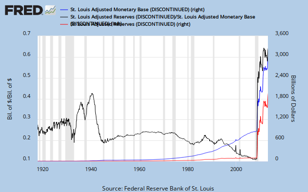
We can also look at bank assets and see a similar picture. In the chart below, TRARR is total bank reserves and AMBSL is the monetary base, both of which are adjusted from billions to millions.

Money is not wealth, it is a medium of exchange that facilitates the purchase and sale of wealth. The nature of the bubble, when the illusion of wealth builds up, is that financial assets are over-valued. If something is over-valued, then by logic something else must be under-valued, relatively speaking. When we look at the ratio of stocks to gold on a long-term chart, what we see is that stocks (financial assets) are over-valued at the peak of the credit cycle, and that gold (real asset) is over-valued at the trough. Over time, of course, all prices denominated in dollars tend to move higher as the currency loses value.
Most price indices, such as the Consumer Price Index (CPI), ignore financial assets and focus on the goods and services that people buy on a regular basis in their normal lives. In essence, the concept of inflation has become tainted by politics. When people's investments are being pumped up, everyone's happy and politicians call it a "strong economy"; but when the cost of living is being pumped up, it's "inflation" and a reason to vote out the incumbent. As the illusion of wealth builds, the velocity of money (ratio of GDP to money supply) tends to slow; when the bubble bursts and real assets begin to outperform financial assets, the velocity of money accelerates. We see below how both the CPI and the velocity of MZM peaked at the trough of the last Major Credit Cycle.

Let's see how closely the performance of the CPI is related to money growth and velocity. Below is a model that estimates where the CPI index should be according to the monetary base and the velocity of MZM, and the actual CPI is displayed alongside.

While the model occasionally calls for dips, notably at recessionary periods, that do not show up in the actual CPI, it seems to provide a reasonably good fit over a period of half a century. It may be that the prices measured by the CPI possess a certain amount of inertia that restrains sharp moves. In any case, let's extend it out a few years to take into account the past four years.

As you can see, there has been a major divergence between the model and actual CPI. And this reflects the same phenomenon discussed above: the massive injection of counterfeit credit has simply not flowed through the financial system. The central bankers are pushing on a string. Or to put it more bluntly, reality is refusing to conform to the academic theories of the economists. Like the monarch of old who ordered the tide to recede, the commands of the central bankers have been ignored by the economic forces of nature.
At the very beginning of this blog I mentioned that, since the peak of the cycle in 1999, the CPI-adjusted DJIA had not fallen as sharply as the gold-adjusted DJIA. The chart below goes a long way toward explaining why not. In January 1913 the CPI was at 9.8 and the dollar was fixed at $20.67 per ounce of gold, so our "model gold" price is simply the CPI multiplied by 2.11 (20.67/9.8). The model and actual gold price are on the right axis, and the 7-year annualized change in the CPI is on the left axis.

Notice how CPI growth bottoms around the Major Credit Cycle peaks (1929, 1966, & 1999), and peaks around the troughs (+/- 1942 & 1980) -- except that CPI growth has not picked up since the last peak in 1999. Then check out how actual gold lagged behind the model in the 1960s, soared far above the model at the trough in 1980, and then fell back until it actually dropped below the model at the cycle peak of 1999.
Since the cycle peak of 1999, gold has rocketed to a height far above the model, which suggests either of two possibilities, or some combination thereof: gold is way above its equilibrium, or the CPI is lagging and has some serious catching up to do. The previous chart suggested that CPI needs to increase about 60% to catch up with the expansion of money supply, so we can imagine a scenario over the next decade where our model gold price climbs to around $800, actual gold glides down to the $500-700 range, and the CPI climbs about 5% annually.
But remember what happened at the last Major Credit Cycle trough in 1980 -- the Fed allowed interest rates to absolutely blow through the roof. The 90-day T-bill hit 17% and the 10-year T-note went over 15% before the markets finally settled down. The Fed is not about to allow that to happen; on the contrary, it is determined to follow the PIMP until the economic forces of nature cease their evil ways and obey the commands of Emperor Bernanke. And as the PIMP drives financial assets into a fresh speculative frenzy, it perversely acts as a drag on the CPI, and the seemingly docile CPI only intensifies the Fed's allegiance to the PIMP.

Before leaving the subject of the CPI, let me remind you that my monetary model for the CPI takes into account the velocity of money (MZM). As you can see above, velocity and gold both peaked almost exactly at the trough of the last cycle. But while gold has come back to hit new highs, money velocity continues to plunge. At some point velocity will reverse, and that increasing velocity should feed through to growth of the CPI.
Suppose that the Fed decided to terminate the PIMP; it's starting to get nervous about the increasing speculative froth in the financial markets and decides to bite the bullet. And as long as we're playing make-believe, let's pretend that Emperor Bernanke suddenly becomes a devout Austrian. So after the next FOMC meeting he announces that going forward the Fed will grow the monetary base at 5% and allow interest rates to find their equilibrium in the marketplace.
The chart below shows federal debt and interest paid on that debt, both as a share of GDP. First notice that interest expense was much higher at the 1990 peak even though debt was much lower than its 1940s peak. Then notice that interest expense has remained near its post-war lows even as debt has climbed back above the 100% level. This reflects the extremely low interest rates that have prevailed recently and during the 1940s.
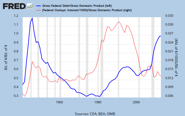
Next I take the ratio of the two items above to get the implied rate of interest that was paid on the debt, and I throw the actual 90-day T-bill rate on the same chart for a comparison. Bear in mind that these are annual figures for GDP and yearly averages for the T-bill rate, and do not even begin to take into account the yield curve for different maturities of treasury issuances. Still, as you can see below, there is a reasonably good fit.

At the trough of the last Major Credit Cycle, interest rates on treasuries went north of 15%. This time around, there has been an unprecedented amount of pushback by central banks. Arguably, the PIMP began not with Bernanke, but with Greenspan when he took the fed funds rate to 1% in 2003 . So once again let me remind everyone how the laws of supply and demand work: a drop in price stimulates demand and discourages supply, an increase in demand pushes up the price, and a drop in supply pushes up the price. So artificially low interest rates discourage savings and encourage borrowing, and a decrease in saving coupled with an increase in borrowing pushes interest rates higher. If we are a decade into the reign of the PIMP, it's safe to say that the Equilibrium Rate is way, way up there. I will go so far as to predict that, when we finally hit the trough of the current Major Credit Cycle, interest rates will take out the highs from the last trough.

Since the total federal debt is now slightly higher than the national GDP, the interest expense in terms of GDP will be slightly higher than the average rate of interest paid on the debt. A 5% rate of interest means the amount of interest expense paid by the federal government is just above 5% of GDP, and so forth. As you can see above, federal spending in the post-war era has been around 20% of GDP. So if the average interest rate paid on federal debt surpasses 10% -- and I think it could go a lot higher -- interest expense alone will be in the neighborhood of half the federal budget. That will absolutely, positively blow up the budget! Given political and economic realities, it will be absolutely impossible to reduce spending and/or raise taxes enough to accomodate that amount of interest expense. And the increase in interest rates will almost certainly be accompanied by a severe recession, which will raise the political pressure for increased government spending and even greater deficits. As markets see the government borrowing more and more just to pay interest on the debt, the government will find itself trapped in a vicious cycle from hell, where higher interest rates lead to more borrowing and more borrowing leads to higher interest rates. Our republic will not survive in its current form (see my solution here).

Above we see the monthly price of crude oil. It hit a high point around the last trough of the Major Credit Cycle and a low point around the last peak. After that cycle peak in 1999 the price of crude shot higher, peaking around $135 (monthly average) and then plunging back to $40. The action of the last five years can actually be interpreted as a contracting triangle, which is usually a consolidation pattern, and if crude breaks out to the upside implies a target about $95 above current levels. I think we can all imagine what crude near $200 would mean for the economy. The question is, will it break out to the upside or to the downside?
If the Fed maintains its allegiance to the PIMP, then I believe that eventually crude will break higher. But if the Fed ends the insanity and allows financial economy to finally converge with the real economy, then crude will head back toward the $40 level.
GDP stands for Gross Domestic Product, emphasis on gross. It doesn't take into account the normal depreciation of the nation's capital stock, the inevitable wear and tear that every day grinds away at our infrastructure. The slowly decaying bridge in Minnesota has no impact on measured GDP, and its eventual collapse due to a lack of maintenance has no measured impact, but the cost of its reconstruction does increase the measure of GDP. That reconstruction has not added to the total wealth of the nation, however, it has only restored at great cost an asset that could have been properly maintained at much lower cost. How much vital maintenance is being deferred in order to finance the profligacy of Big Brother and the Nanny State?
We are eating our seed corn. We are consuming the capital that was built up by previous generations, and at an ever-increasing rate. While the financial economy is flush with central bank liquidity, the real economy is starved for investment because the PIMP has destroyed incentives to save, and savings are the only source of real capital.
Ben Bernanke has a tiger by the tail -- he dare not hang on but he dare not let go. My suspicion is that every day he prays for the current false equilibrium to endure until he can retire with dignity. It was the belief of Ivory Tower Economists that if enough counterfeit credit was pumped into the financial system, lending to businesses would increase and that increased lending would lead to an economic resurgence. The moral and idealogical bankruptcy of that belief is now obvious to all, but the ITEs and their acolytes refuse to countenance any alternative to our continued progress down the road to ruin.
Eventually, the divergence between the financial economy and the real economy will be resolved. The more that central banks strive to maintain the divergence, the greater become the forces of economic nature pushing toward convergence. The Fed could still decide to allow the financial economy to move back toward the real economy, and effectively push over-indebted institutions into bankruptcy. That way lies economic collapse, a breakdown of governments and the rise of revolution. Not surprisingly, central banks continue to follow the PIMP.
At some point, however, the dam will break and all the counterfeit credit that central banks have pumped into the banking system will flood into the real economy. But it will not flow into real investments because it is not real capital. It will instead stream into real assets that represent safe havens from the massive monetary dilution to which central banks have dedicated themselves. It will flow into gold, silver and commodities such as crude oil. The real economy will move toward the financial economy, prices will move higher across the board, central banks will struggle to accomodate the increased demand for money by increasing their injections of counterfeit credit, and finally paper currencies will collapse into the whirlwind of hyperinflation. That way lies economic collapse, a breakdown of governments and the rise of revolution.
Let me wind down this diatribe by going back to where I began. Below is a chart of the DJIA/Gold ratio using daily data. The recent peak was around 45 ounces of gold on August 25 of 1999, and the strenuous efforts of the Fed have created a local bottom at 5.8 ounces on August 22 of 2011, a span of almost exactly one dozen years. When we arrive at the trough of the current Major Credit Cycle, the DJIA should approach a level equal to one single troy ounce of gold. We have a long way to go.

Below we take another look at stock prices (DJIA) and two real assets, crude oil and gold, with all three set equal to the number one (1.0) at the recent peak of the Major Credit Cycle on August 25 of 1999. This provides a nice perspective on the relative performance of these assets over the long term.

Finally, let's take a closer look at interest rates and the Major Credit Cycle. Below we see the ratio of bond prices to gold. (I used Moody's AAA because the data goes back to 1919, and used the PV function to get the price of a 100 par, 30-year, 5% annual coupon bond; the gold price is $20.67 until 1934 when it jumps to $35.00, and from 1968 onward I use the monthly average of the London PM fix.) What we see is a stair step pattern, where the bond price in terms of gold holds steady for a long period and then drops sharply. In the 1930s the drop was almost a straight line down, reflecting the official devaluation. In the 1960s a long slide began that only ended in 1980 at the trough of the credit cycle.

Let's take a closer look at the previous chart; below is the same bond/gold ratio, but using daily data and T-note yields. Here we can clearly see the contrast between the bear market in bonds, which came to an end at the trough of the last cycle, and the bull market that continues to this day. Still, although the bull market continues, the bond/gold ratio topped out around the peak of the cycle in 1999.

The bull market in bonds, more than three decades old, is getting rather long in the tooth. If the next bear market is anything like the last, bond investors would be well advised to buckle up and brace themselves for a series of stomach-churning air pockets. From the high of around four ounces of gold in the 1940s, the (futures equivalent) bond price fell to less than one tenth of an ounce at the low in 1980. That's a drop of 97% in real value!!!
Now of course investors were receiving coupons from their bonds, so the net loss was not quite that bad. But still, a portfolio of bonds whose income would have provided a solid middle class income before the beginning of WWII was probably not enough to even pay the rent and groceries by the end of the 1970s. But look at the bull market that followed! It looks more like a sideways market than a strong rally. Yes, the bond price went from one tenth to about four tenths of an ounce, but that doesn't even begin to claw back all the value that was lost in the previous bear market.
The bond/gold ratio is currently around one tenth of an ounce of gold, back near its low of 1980. I'm going to go out on a limb and make a prediction that I'm sure will make me a laughingstock for anyone who worships the god of paper money. My prediction: when we finally hit the trough of the current cycle, the price of Treasury Note futures in terms of gold will hit zero.

Above we see the same values that made up the previous chart, but the individual components rather than their ratio, and the bond yield rather than the price. Notice once again how the price of gold and bond yields both peaked near the trough of the last cycle in 1980. But while gold, since the recent peak of the cycle in 1999, has rocketed to new highs, bond yields have continued to decline.
I believe this reflects the "flight to quality" that has occurred since the recent peak of the cycle, and especially since the debacle of 2008. Financial theorists like to build their equations around the concept of the "risk-free rate of interest," and government bonds are typically used as proxies for this concept. But since the debacle of 2008, the universe of "risk-free" government bonds has shrunk, and this shrinkage has increased the relative value of those bonds that remain members of the "risk-free" club.
When a chain breaks, it's always the weakest link that snaps. And in the complex financial system that ties together the economies of the world, it is the weakest economy that collapses first, and then the second weakest, and then the third weakest, and so forth and so on. And the process continues until every insolvent institution has been forced into default.
Virtually every government in the world is ruled by politicians who entrench themselves in power by borrowing from the future in order to provide freebies to their constituents today. This model is guaranteed to eventually blow up as each government hits the limits of its borrowing capacity. And as I have explained above, it is my belief that governments have already begun hitting those limits. Eventually, even the United States will succumb to the inevitable. But for now, in the world's laundry basket of soiled assets, U.S. treasuries continue to be the cleanest dirty shirt.
Well I woke up Sunday morning,
With no way to hold my head that didn't hurt.
And the beer I had for breakfast wasn't bad,
So I had one more for dessert.
Then I fumbled through my closet for my clothes,
And found my cleanest dirty shirt.
An' I shaved my face and combed my hair,
An' stumbled down the stairs to meet the day.